Data Analysis of School information
Just a quick rundown of some of the data analysis that was done based on the information provided in the dataset we used throughout the project.
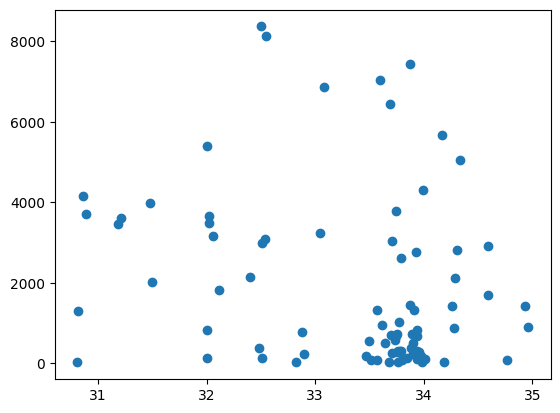
Scatter plot graph of the amount of enrollement over a location.
This is the scatterplot where enrollment vs. latitude was graphed with Enrollment being the y-axis and the latitude on the x-axis. This didn't work because only one of the two parts of a coordinate was used in the graph and that multiple schools can have the same latitude with the absolute lack of correlation. This graph doesn't have any particular results, but it formed the foundation for what would be done for the final graphs.
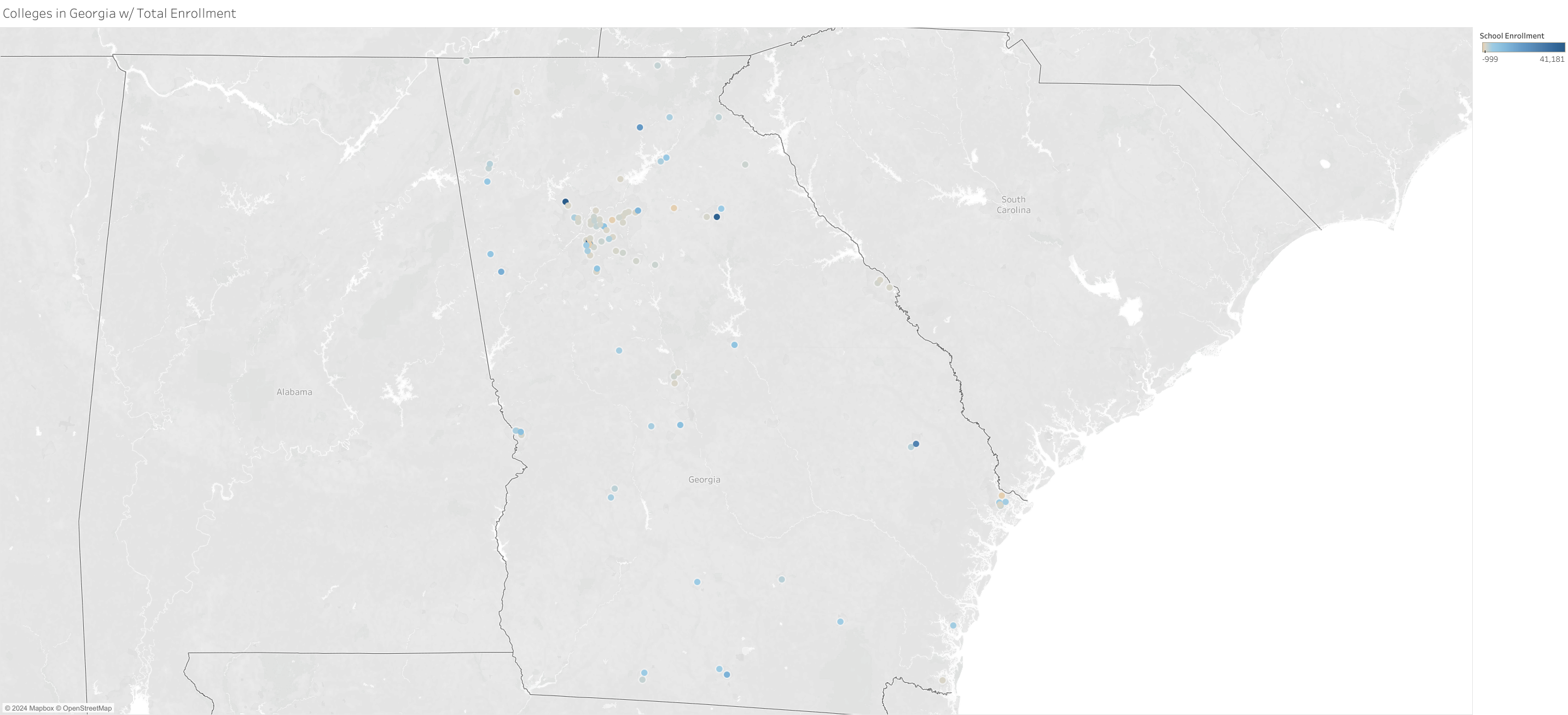
Geo Map location of school location and enrollment by hue of color with outliners
This prototype geo map is the version with outlier values and the finalized version is the one without. The outlier values were schools with the null value for enrollment and schools with >10K enrolled students.
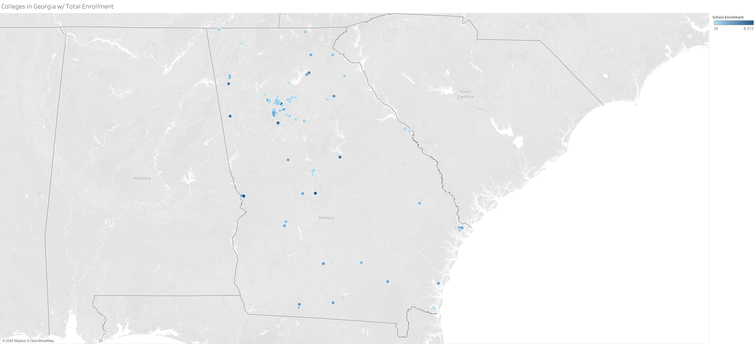
Geo Map location of school location and enrollment by hue of color without outliners
There's a cluster of colleges near Atlanta as one may expect from a population center. The most popular colleges are spread throughout the state.