Visualization
ITEC 4230 Data Science and Analytics Project,
Anca Doloc-Mihu
(License: CC BY-SA 4.0)
What is Visualization?
Visualization or visualisation is any technique for creating images, diagrams, or animations to communicate a message. Wikipedia* Visualization through visual imagery has been an effective way to communicate both abstract and concrete ideas since the dawn of humanity.
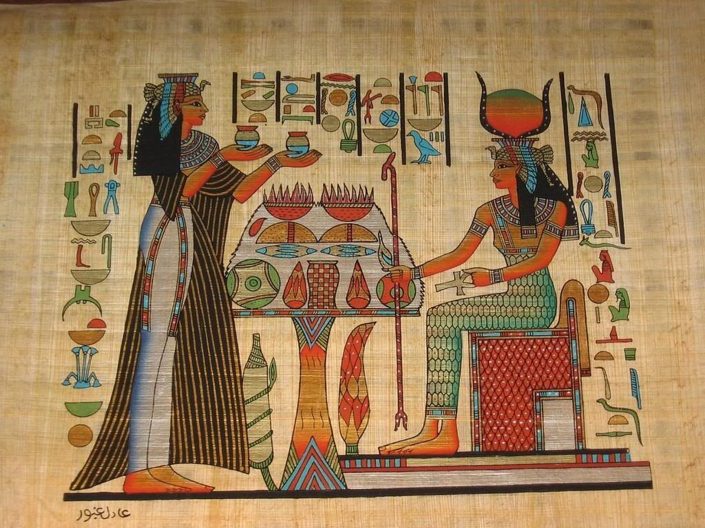
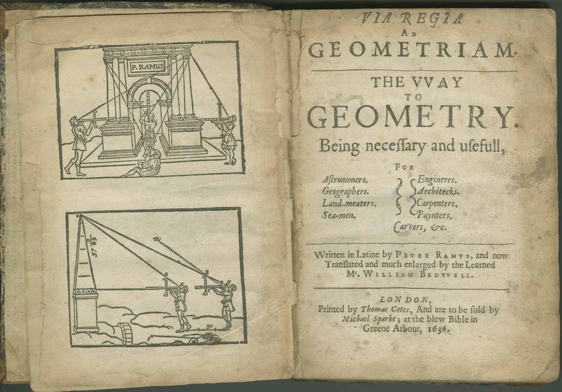
* Examples from history include cave paintings, Egyptian hieroglyphs, Greek geometry, and Leonardo da Vinci's revolutionary methods of technical drawing for engineering and scientific purposes.


What is Visualization?
Data visualization (often abbreviated data viz) is an interdisciplinary field that deals with the graphic representation of data.
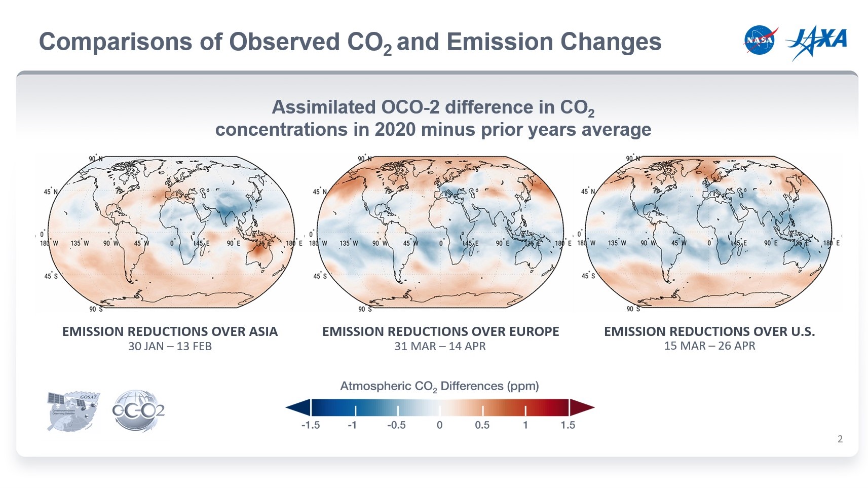
It is an efficient way of communicating when the data is numerous as for example a Time Series.
It builds a mapping between the original data (usually numerical) and graphic elements (for example, lines or points in a chart) to show visually how the attributes of these elements vary according to the data.
It is generally considered a branch of Descriptive Statistics, and it is argued by some authors that it is both an Art and a Science.
Why is Visualization so important?
At their best, graphics are instruments for reasoning about quantitative information. Often the most effective way to describe, explore, and summarize a set of numbers is to look at pictures of those numbers. The Visual Display of Quantitative Information by Edward R. Tufte, Yale University
A picture is worth a thousand words is an English language adage meaning that complex and sometimes multiple ideas can be conveyed by a single still image, which conveys its meaning or essence more effectively than a mere verbal description. Wikipedia
Why is Visualization so important?
Good data visualization COMMUNICATES your idea quickly to everyone
Example 1: To depict how waves of immigrants shaped the United States, a team of designers looked to nature as a model.
Why is Visualization so important?
Good data visualization COMMUNICATES your idea quickly to everyone
Example 2: To depict an information event in human history from Wikipedia. Histography
Visualization Best Practices
- As simple as possible
- Stands on its own
- Minimize ink
- Label clearly
- Same font size
- Significant figures
- Substance over splash
- Avoid bias
- Leverage Gestalt Laws of grouping
- Highlight key data
- Use right graph for data
Emphasis Guidelines for Dashboards
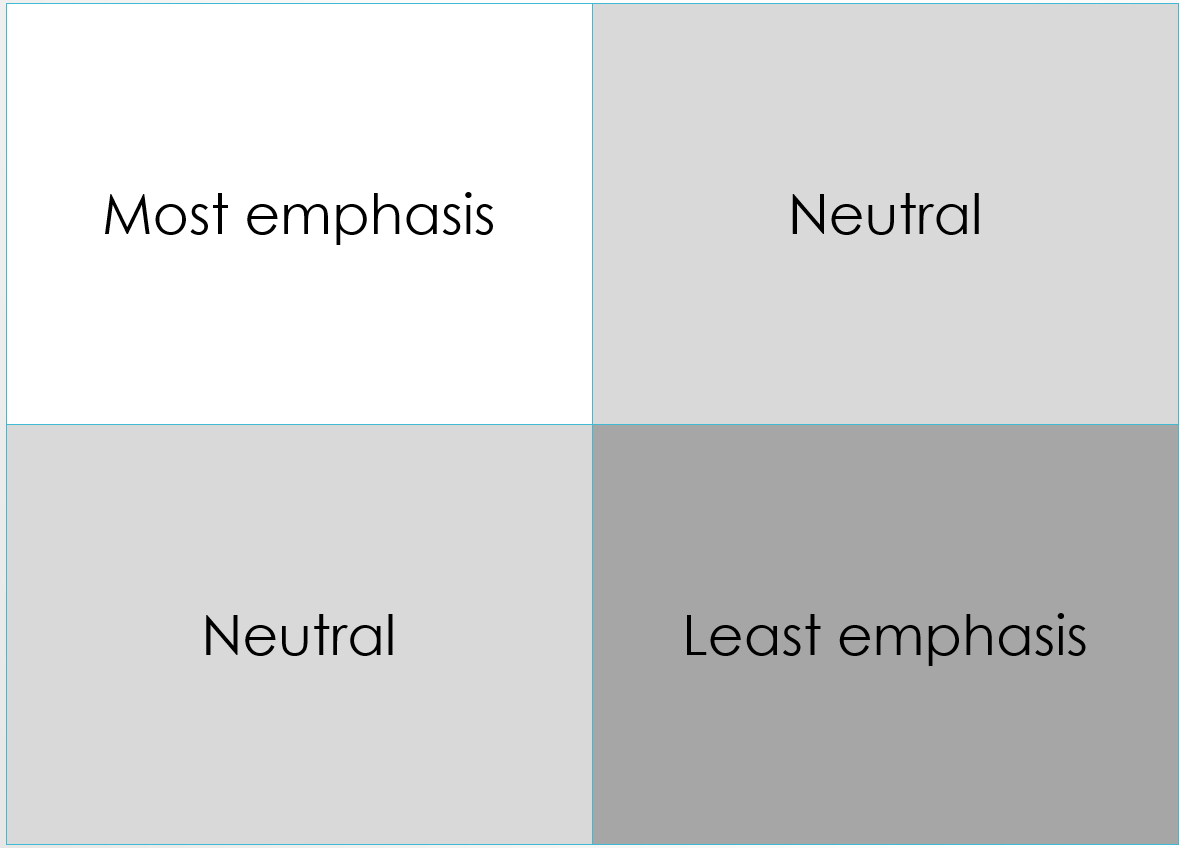
Dominance of the neutral quadrants may change based on content. F-Shaped Pattern of Reading on the Web
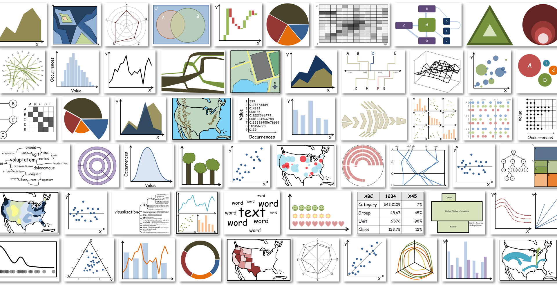
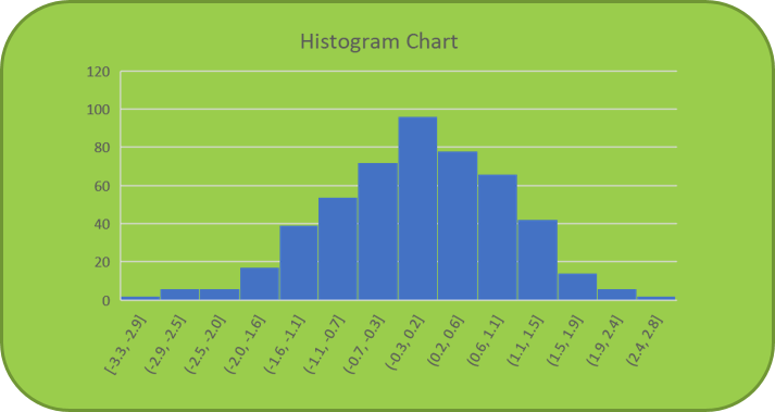
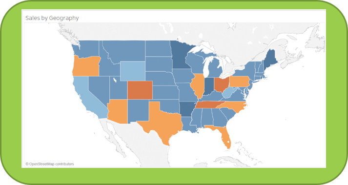
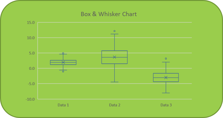
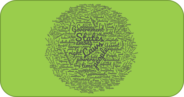
Types of visualizations
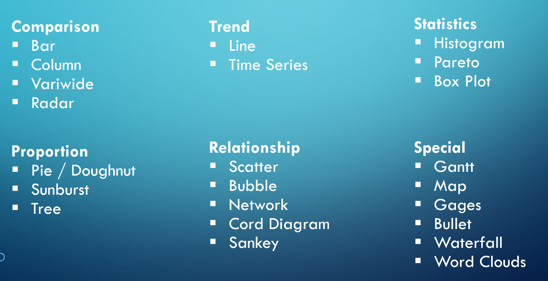
Types of visualizations
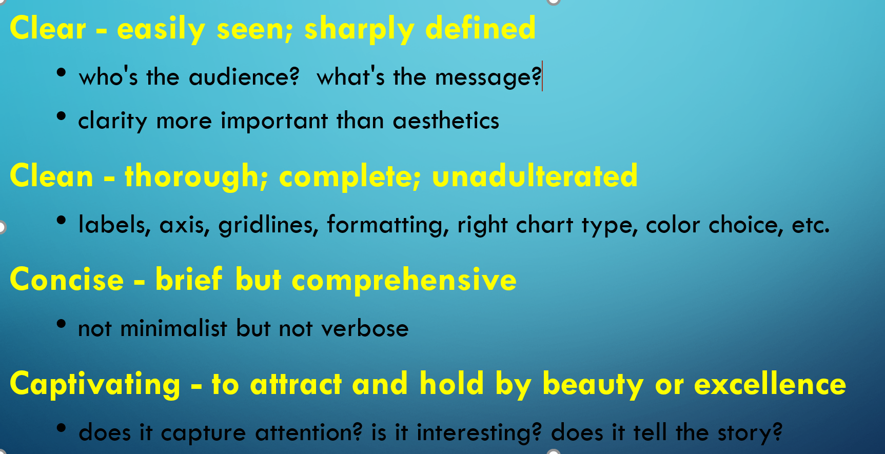
Shaffer 4 C’s of Data Visualization
New Visualizations inspired from Data Science
-
Interactive visualizations that one can build and manipulate within the browser
-
Build and manipulate via code
-
Good quality images
-
Easy to share with collaborators
-
Re-usable
-
Scalable
*and more
=====> Notebooks
Notebooks
- Jypyter
- Observable
Open my Jupyter notebook Visualization practice